
|

|
|
| Home | Live Data | Instruments | CHRNS | Proposals |
Intro Next page Previous page
While Chi-squared and R-values provide some measure of how a fit is progressing, the only way to actually understand the quality of the fit and what problems need to be corrected, is to look at agreement between the observed diffraction data and the corresponding values computed from the fit. This is sometimes called a Rietveld plot.
GSAS/EXPGUI Alumina tutorial (part 6)
Plotting the Initial Fit
The GSAS program POWPLOT and the EXPGUI program LIVEPLOT allow the fit to be examined graphically. In this tutorial step, LIVEPLOT is used to examine the results.
Press the LIVEPLOT button on the button bar (or use a menu command) to start LIVEPLOT. You should then see a plot like the one below.
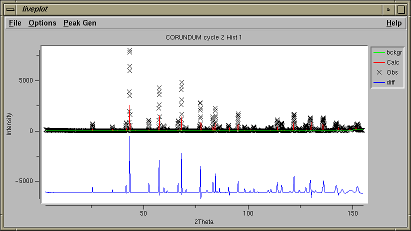
In this plot, the data are "X" characters, the calculated values are a red line. The fitted background is shown as a green line. Offset below, the observed pattern minus the computed pattern is shown in blue. The observed and computed values do not agree very well, but seem to follow the same trends. In the subsequent plots we will see in more detail what some of the discrepancies are.Note that the size of the plot can be changed by changing the size of the window.
It will help to see the actual positions of the reflections. This display can be turned on by pressing the "1" key (1 for phase 1, 2 for phase 2...) in the LIVEPLOT window. (This can also be done using the Tickmarks submenu in the File menu.)
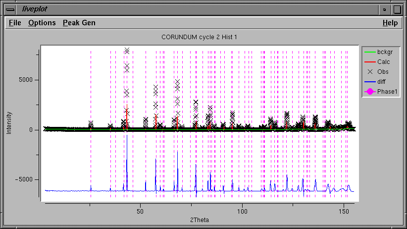
Note that the color, length, style, placement of the tick mark lines can be changed in the Options menu.Note also that the reflection indices for a tick mark can be displayed by pressing the "h" key when the cursor is positioned over a tick mark.
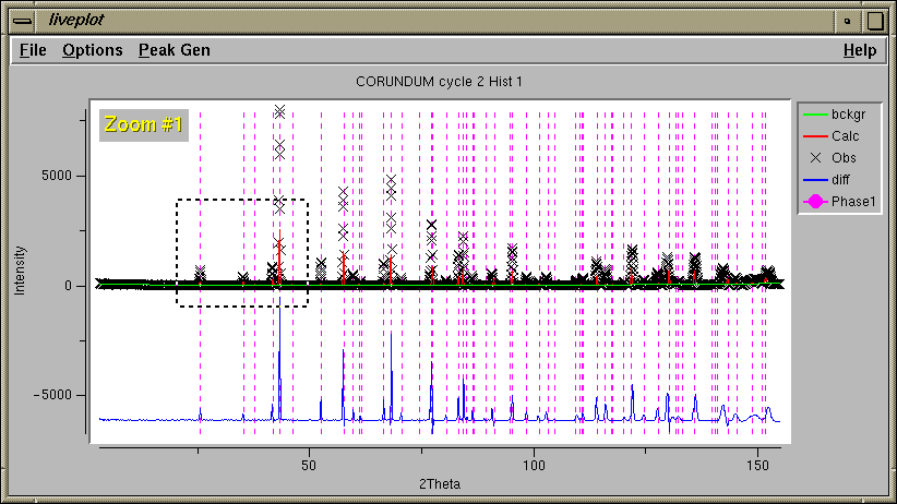
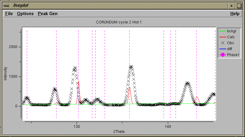
With all the data displayed, at appears that the tick marks are in the right places at lower angles, but are not well placed at 140 degrees and higher. It would be good to see the plot at high magnification to see more detail, however. "Zooming in" is accomplished by clicking the mouse in the lower left and upper right corners of the region to be viewed (lower right & upper left also works). A box is displayed, as below, after the first mouse click. After the second the plot is redrawn.
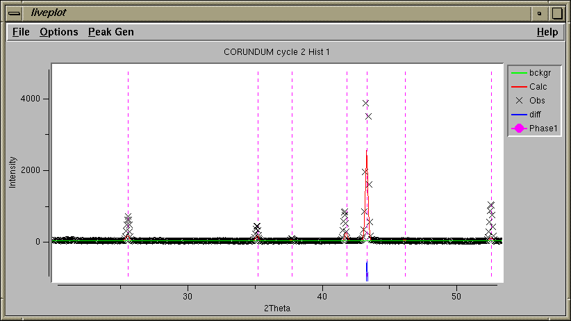
Note with the plot zoomed in, it can now be seen that the lattice parameters do not index the peak 42 degrees very well. The computed peak widths agree reasonably well with the observed.
The fit is even worse at high angle. Also, the computed peak widths are much narrower than the observed.
Previous: Initial Fitting: Refine Scale Factor and Background
Next step: Fitting the Unit Cell
Comments, corrections or questions: crystal@NIST.gov
Last modified 18-July-2003 by website owner: NCNR (attn: Craig Brown)
$Revision: 1.1 $ $Date: 2002/07/18 20:45:10 $